


AIFUL CORPORATION (President & CEO: Mitsuhide Fukuda; hereinafter “AIFUL”) hereby announces the name and corporate logo of the new holding company scheduled to be established on Wednesday, April 1, 2026.
 Name of the New Holding Company
Muninova Holdings Inc. (hereinafter referred to as “Muninova Holdings”)
AIFUL has expanded its group while building a strong brand centered on the Unsecured loan business for many years. Based on the achievements and experience cultivated so far, we are starting a challenge to the next brand stage. While continuing the unsecured loan business as AIFUL, the new holding company will be given a new name to aim for more diverse business development.
Muninova Holdings will promote diversification into various business areas beyond the loan business and strive to further enhance brand value and corporate value as a whole group.
Concept of the Company Name
The name of the new holding company embodies the following meanings:
- Muninova = a unique place (“Muni no ba”) → A new central hub for the Group
- Muni = one and only (“Yuiitsu Muni”) → Suggests uniqueness
- Nova = a new star (“Nova”) → Refers to a star that suddenly becomes drastically bright and visible
The concept of a “Nova”—a once-invisible star suddenly shining brightly—also resonates with how individuals can suddenly illuminate their surroundings when their inner potential and uniqueness are revealed.
“Nova” embodies the idea that even a momentary burst of brilliance can redefine one’s identity and illuminate the path toward the future.
The name “Muninova Holdings” reflects our belief in the natural brilliance that everyone possesses. It conveys our aspiration to support and respect everyone’s uniqueness, and to realize our group vision of “For Colorful Life.”—a society where each person can play an active role.
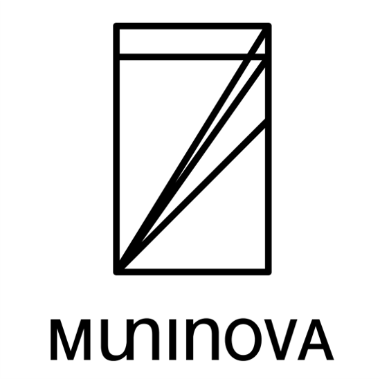
Concept of the Logo
A Comment from Mr. Kitagawa:
The art symbol (figure) imagines the entire group as a sphere, with Muninova Holdings at its center. Based on the mathematical aesthetics of the golden ratio and silver ratio, it overlays the North Star, which continues to show guidance regardless of the era, expressing a shape where multiple invisible circles overlap and expand.
These represent the coexistence of artistry and rationality, the symbol of universality and permanence, and the future image of the company where diverse values connect and transform change into driving force.
The typography (letter) embodies the essence of "future-oriented vision" as a symbol of humanity.
I hope this design will be a trigger to create synergy as a group.
Designer
The naming and logo design for the new holding company were created by Issay Kitagawa, founder and creative director of GRAPH, who also involved in the renewal of AIFUL’s visual identity.
[About Issay Kitagawa]
GRAPH CEO / Designer / Artist
Born in Kasai City, Hyogo Prefecture in 1965. Graduated from the University of Tsukuba in 1987. Joined GRAPH (former: Kitagawa Shiki Printing Co., Ltd) in 1989. Aiming to create communication designs that resonate with the heart of people, he consistently carries out designs, branding, intellectual property management, character development, manufacturing, etc. By proposing “design as a management resource” from the perspectives of both managers and designers, he has gained the support of many clients from local SMEs to well-known overseas luxury brands.